
UI Builder
This is the builder that you'll use to create your Multimodal form. The builder is separated into two sections that will help you build and edit your form based on your project's requirements. After creating the project, you may build a custom form from scratch or select from a number of available templates. Building the form involves the use of various UI components and their customized functionality, which can be defined through the Code Editor.
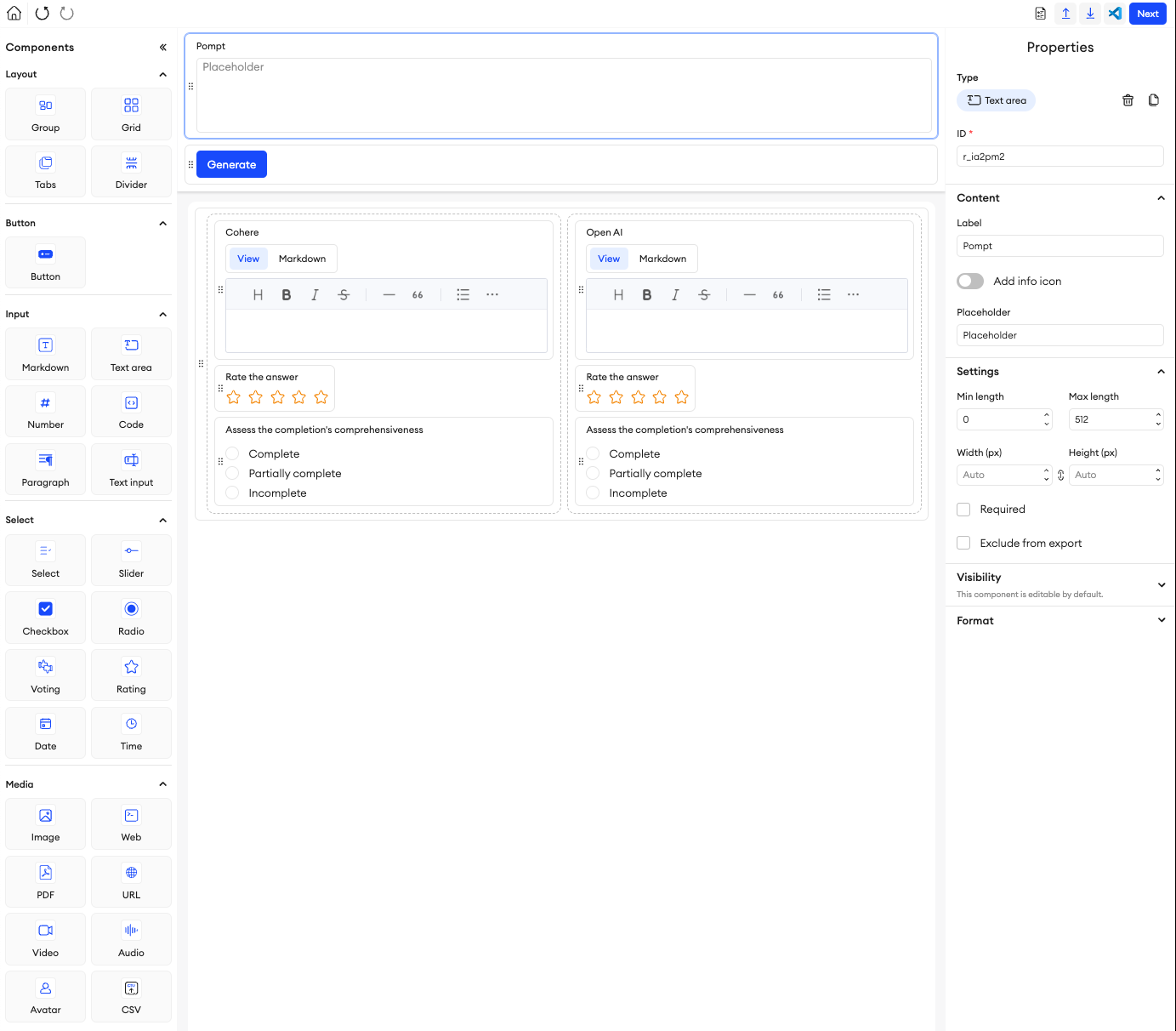
Canvas
The central space of the UI Builder is your canvas. This is where you compose and build your form by placing and fine-tuning each component here. At the top of the canvas, there is a header that you can place components into to fix them in a static position. You can collapse and expand this header as needed. Below this is the body of the canvas, where the rest of your form will go. You can use the various properties of each component to configure them to your liking.
General properties
There are multiple components available in the UI Builder. Each component on the UI should have its own unique ID that is auto-generated, but can be changed to a more defining value. You should keep in mind that there are a few reserved IDs that can’t be used for any component, and these are: _item_name, _item_category, and _folder.
The rest of the component’s properties are divided into sections: Content, Settings, Visibility, and Format.
Content
You can manage and control the component’s main properties here. This includes its values and composition.
Settings
You can manage and fine-tune a component’s settings to make sure it looks and behaves the way you want. These settings include things like component positioning, sizing, value ranges or limitations, whether or not to exclude it from the export JSON, and whether or not the component is required to be fulfilled before an item is completed.
Visibility
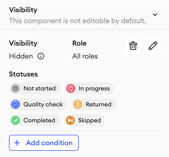
You can modify the permissions on each individual component (except Grid) so that they can either be Hidden or View only. You can select one or multiple roles and statuses that this setting is applicable to, including any custom ones available in your project. This can be done when defining the properties of the component.
If there are multiple components that you want to have the same Visibility permissions for, you can copy the settings of one component and paste it onto another. You can do this by clicking the respective buttons to Copy (or Alt + Ctrl + C) the permissions, and Paste (or Alt + Ctrl + V) them.
Format
Some components will give you the option to format their appearance. This includes background styles, title styles, and button styles.
README
You can create a README file for your project’s form while in the UI builder. This README file will be visible any time this project’s form is opened in the builder and can be accessed from the top-right corner. You can use it to include any important or key bits of information about your project and form.
To create a README file:
- Enter the project’s form builder either during project creation or from the project’s settings.
- In the top right, click the README button.
- Type in all the information you want to include.
- When you’re done, click Apply.
- Click Next in the top-right corner.
- Click Publish (if done during project creation) or Update (if this is an existing project).
To edit a README file:
- Enter the project’s form builder from the settings.
- In the top right, click the README button.
- Click the Edit button.
- Make your changes accordingly.
- When you’re done, click Apply.
- Click Next in the top-right corner.
- Click Update.
Components
You can find these components under the following categories.
Updated about 1 month ago