
Button
Button
This button is a simple component that can be programmed to respond in any given way when clicked.
Parameters
Label- A switch to enable or disable the adding of a text to the button. If disabled,Iconwill automatically be enabled.Icon- A switch to enable or disable the adding of an icon to the button (recommended). If disabled,Labelwill automatically be enabled.Add info icon- Disabled by default. When enabled, it shows a tooltip icon on the component. The tooltip shows text that can be entered in the component’s properties.Horizontal alignment- You can align the button to the Left, Center, or Right.
Related Functions
disable(path: List[Union[str, int]])- Disables the component.enable(path: List[Union[str, int]])- Enables the component.setloading(value: boolean, path: List[Union[str, int]])- Sets the component to a loading state.
Related Events
on_<component id>_click(path: List[Union[str, int]]):- Fired when the button is clicked.

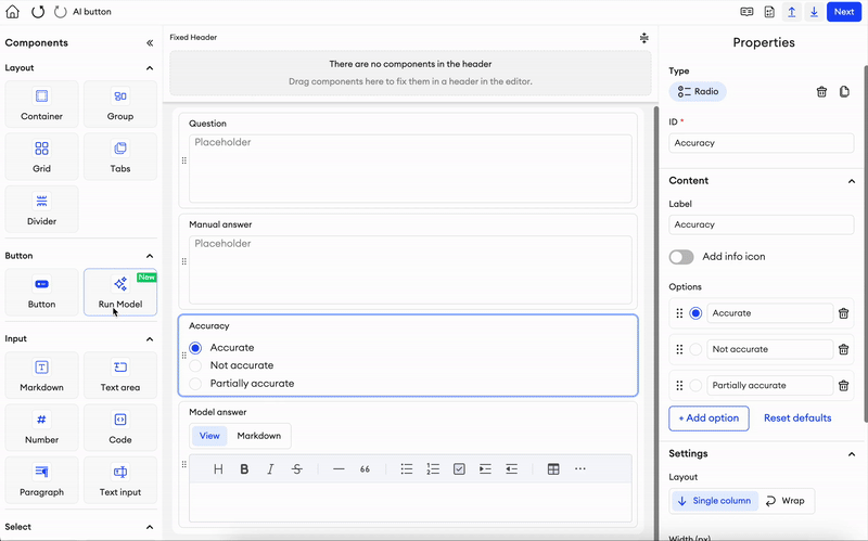
Run Model
This button can be integrated with a model connected to your team and then used to run basic or advanced prompts. Read more about using this component with group components here.
Parameters
Model- A dropdown list of connected models in the team.Advanced prompt- Disabled by default. A switch to enable or disable adding advanced prompts to your button. This alters how theModel inputworks.Model input- A dropdown list of any input components (must be Text Input) in the form. IfAdvanced promptis enabled, then this becomes an input field where you can write up a prompt and inject other components’ values by using{component_ID}(can be Select, Checkbox, Radio, Voting, Rating, Slider).Model output- A dropdown list of applicable output components in the form. The components can only be: Text Input, Text Area, Markdown, Code, Paragraph, or Web for text value, and Number, Slider, Rating, or Voting for numeric value.Label- A switch to enable or disable the adding of a text to the button. If disabled,Iconwill automatically be enabled.Icon- A switch to enable or disable the adding of an icon to the button (recommended). If disabled,Labelwill automatically be enabled.Add info icon- Disabled by default. When enabled, it shows a tooltip icon on the component. The tooltip shows text that can be entered in the component’s properties.Horizontal alignment- You can align the button to the Left, Center, or Right.
Regarding numeric outputs (Number, Slider, Rating, or Voting)Along with the prompt, we also send a JSON schema as a response structure that the model should follow. The JSON schema includes:
- type ("number" and "null")
- minimum (if the component has a set min value)
- maximum (if the component has a set max value)
The structured output works only for models that support tool use.
Related Functions
disable(path: List[Union[str, int]])- Disables the component.enable(path: List[Union[str, int]])- Enables the component.setloading(value: boolean, path: List[Union[str, int]])- Sets the component to a loading state.runAgents()- When fired, runs the corresponding model with any given prompts or parameters. Learn more
Related Events
on_<component id>_click(path: List[Union[str, int]])- Fired when the button is clicked.
Link
This button allows you to incorporate any given link to be opened when clicked.
Parameters
URL- You can provide the URL that you want the button to redirect to.Label- A switch to enable or disable the adding of a text to the button. If disabled, Icon will automatically be enabled.Icon- A switch to enable or disable the adding of an icon to the button (recommended). If disabled, Label will automatically be enabled.Add info icon- Disabled by default. When enabled, it shows a tooltip icon on the component. The tooltip shows text that can be entered in the component’s properties.Horizontal alignment- You can align the button to the Left, Center, or Right.Exclude from annotation JSON- If checked, this component and its values will be excluded from the item’s annotation JSON. You also won’t be able to upload data for it.
Related functions
sa.enable(path: list[tuple[str, int]])- Enables the component.sa.disable(path: list[tuple[str, int]])- Disables the component.sa.getValue(path: list[tuple[str, int]])- Returns the data of the component.sa.setValue(path: list[tuple[str, int]], value: str)- Sets the data of the component.
Updated about 1 month ago
Did this page help you?