
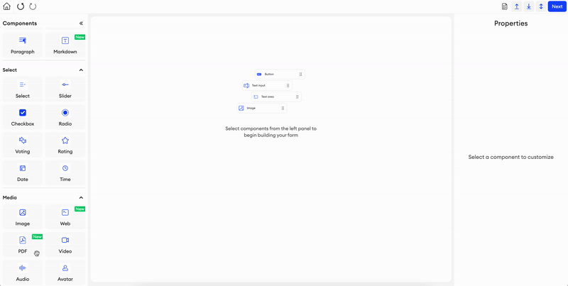
Media
Image
This is an image component. It displays any image, whether you provide the source for it or if the user uploads one.
There are a couple of ways you can alter how you view your image:
- You can click on the image either in the form preview or in the editor to view it up close. Viewing the image in this way, you can zoom in for a closer inspection, and even rotate the image.
- You can click on the settings in the top right corner of the component to adjust the brightness and contrast of the image (min -100%, max 100%).
Parameters
Label- Text input indicating the label of the component visible in the UI.Add info icon- Disabled by default. When enabled, it shows a tooltip icon on the component. The tooltip shows text that can be entered in the component’s properties.Source URL- A source URL of the image.Alt text- Alternative text.Width- The default width of the component.Height- The default height of the component.Fill image- An option to fill the image within the component.Fit image- An option to fit the image within the component.Exclude from annotation JSON- If checked, this component and its values will be excluded from the item’s annotation JSON. You also won’t be able to upload data for it.
Related Functions
getValue(path: List[Union[str, int]])- Returns the url of the image component.setValue(path: List[Union[str, int]], value: str)- Sets the url of the image component.

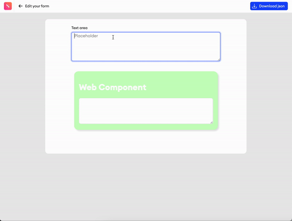
Web
With this component, you can use custom code to display a webpage in the form. You may also make this component’s keys Required to ensure all required fields are filled before the item’s status is changed and the annotation process moves forward.
Parameters
Add info icon- Disabled by default. When enabled, it shows a tooltip icon on the component. The tooltip shows text that can be entered in the component’s properties.+ Set keys- Under Values, you can set up to 10 key-value pairs for the values of the Web component, which can then be queried in Explore using the component’s ID. For this, you must provide a key name and a value type (String, Number, Timestamp). You may also select whether or not this key is an array. These keys can be edited at any time. The value types are as follows:- String - the value must be a string input.
- Number - the value must be numeric.
- Timestamp - the value must be in ISO 8601 formatting.
Code- By editing the component directly from the canvas, you can write your web code. You can then click Save to see what it'll look like before creating the form.Width- The default width of the component.Height- The default height of the component.Max Height- toggle, disabled by default - You can toggle this setting to enable or disable a maximum height for the component. When enabled, any increase in the component’s height from added content will not exceed the set maximum height.Exclude from annotation JSON- Checkbox. Disabled by default. If checked, this component and its values will be excluded from the item’s annotation JSON. You also won’t be able to upload data for it.
Related Functions
-
getValue(path: List[Union[str, int]])- Returns the value of the component’s code. -
setValue(path: List[Union[str, int]], value: str)- Sets the value of the component’s code. -
postMessageToWebComponent(path: List[Union[str, int]], message: Union[str, dict])- Sends themessagestring to the web component. -
getItemStatus()- Returns the status name of the currently opened item. -
getUserRole()- Returns the role name of the user who currently has the item open. -
getTelemetryTime(): number | null- Returns the total time (in seconds) that the user has spent on the current item, as tracked by the Telemetry system.- You may also use this function anywhere else in the code editor using the
getTelemetryTime() -> int | Noneformat.
- You may also use this function anywhere else in the code editor using the
-
setKeySchema(SCHEMA)- defines the key-value pair schema for a Web Component through the code editor. Each web component can hold up to a maximum of 200 keys. -
isValid()- Checks whether the specified key is valid. If the key isemptyornull, the function returnsfalse. -
navigateTo(url: string, target?: "currentTab" | "newTab"): void- Opens the specified URL in either the current tab or a new tab, based on the selected target. -
showPushNotification(message: string): void- Shows browser push notifications if the user allows it (will be requested on first usage). This function is affected by any browser or OS settings that disable notifications. -
refreshPage(bypassCache?: boolean): void- Reloads the current page. WhenbypassCacheistrue, the function requests a reload without using cached content, subject to browser support.
Related Events
on_<component id>_message(path: List[Union[str, int]], value: Union[str, dict]):- Fired when there is a message from the web component, receives the component's path and the value of the incoming message.
Setting up a schema through code
SA.setKeySchema([
  { key: "model_name", type: "string", isArray: false },
  { key: "confidence_score", type: "number", isArray: false },
  { key: "tags", type: "string", isArray: true }
])
The Web component must contain <!-- HAS_KEY_SCHEMA --> for this function to work.
Setting up component permissions
When you’re adding a condition in the Permissions section, you can create a custom one by typing a name for it and clicking + Create Permission.
You can copy this code snippet from the Permissions modal to retrieve any permissions you’ve set so that you may configure them in your Web component.
/* permissions = {hidden: false, } */ SA.getPermissions().then((permissions) => console.log(permissions)); SA.on('permissionsChange', (permissions) => console.log(permissions));Sending messages from web component
window.parent.postMessage({ action: 'topy', data }, "*");- Use this JavaScript function to send a message to the main editor. Usetopyas an action identifier.
PDF
This component allows you to import a PDF file and view it in the form.
Parameters
Label- Text input indicating the label of the component visible in the UI.Add info icon- Disabled by default. When enabled, it shows a tooltip icon on the component. The tooltip shows text that can be entered in the component’s properties.Source URL- A source URL of the pdf.Height- Numeric input that defines the height of the web component.Width- The default width of the component.Height- The default height of the component.Exclude from export- Checkbox. Disabled by default. When enabled, the value of the component will be excluded from the exported annotation JSON.
Related Functions
getValue(path: List[Union[str, int]])- Returns the url of the PDF component.setValue(path: List[Union[str, int]], value: str)- Sets the url of the PDF component.
URL
With this component, you can provide a source URL to display a webpage in the form.
Parameters
Add info icon- Disabled by default. When enabled, it shows a tooltip icon on the component. The tooltip shows text that can be entered in the component’s properties.URL- You can provide the url of the webpage you want displayed on this component.Height- Numeric input that defines the height of the web component.Exclude from annotation JSON- Checkbox. Disabled by default. If checked, this component and its values will be excluded from the item’s annotation JSON. You also won’t be able to upload data for it.
Related Functions
getValue(path: List[Union[str, int]])- Returns the value of the component’s code.setValue(path: List[Union[str, int]], value: str)- Sets the value of the component’s code.
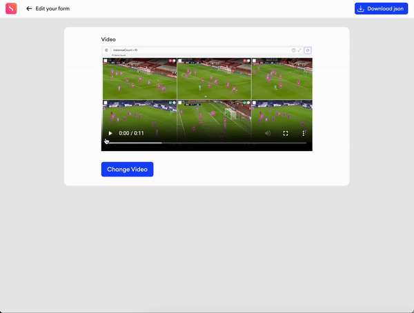
Video
This is a video component. It displays any video, whether you provide the source for it or if the user uploads one.
Parameters
Label- Text input indicating the label of the component visible in the UI.Add info icon- Disabled by default. When enabled, it shows a tooltip icon on the component. The tooltip shows text that can be entered in the component’s properties.Source URL- A source URL of the video.Width- The default width of the component.Height- The default height of the component.Exclude from export- Checkbox. Disabled by default. When enabled, the value of the component will be excluded from the exported annotation JSON.
Related Functions
getValue(path: List[Union[str, int]])- Returns the url of the video component.setValue(path: List[Union[str, int]], value: str)- Sets the url of the video component.
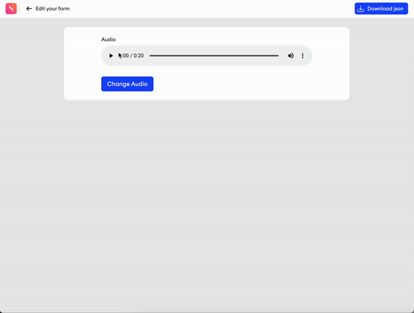
Audio
This is an audio component. It displays any audio clip, whether you provide the source for it or if the user uploads one.
Parameters
Label- Text input indicating the label of the component visible in the UI.Add info icon- Disabled by default. When enabled, it shows a tooltip icon on the component. The tooltip shows text that can be entered in the component’s properties.Source URL- A source URL of the audio.Width- The default width of the component.Exclude from export- Checkbox. Disabled by default. When enabled, the value of the component will be excluded from the exported annotation JSON.
Related Functions
getValue(path: List[Union[str, int]])- Returns the url of the audio component.setValue(path: List[Union[str, int]], value: str)- Sets the url of the audio component.
Avatar
This component is an avatar icon display. It displays an avatar image, whether you provide the source for it or if the user uploads one.
Parameters
Label- Text input indicating the label of the component visible in the UI.Add info icon- Disabled by default. When enabled, it shows a tooltip icon on the component. The tooltip shows text that can be entered in the component’s properties.Source URL- A source URL of the avatar image.Alt text- Alternative text.Exclude from export- Checkbox. Disabled by default. When enabled, the value of the component will be excluded from the exported annotation JSON.
Related Functions
getValue(path: List[Union[str, int]])- Returns the url of the avatar component.setValue(path: List[Union[str, int]], value: str)- Sets the url of the avatar component.
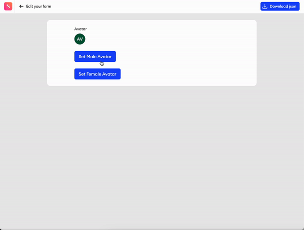
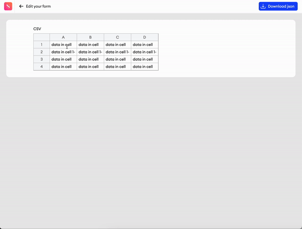
CSV
This component allows you to display editable CSV grids in your forms.
Parameters:
Label- Text input indicating the label of the component visible on the UI.Add info icon- Disabled by default. When enabled, it shows a tooltip icon on the component. The tooltip shows text that can be entered in the component’s properties.Value- Text input field where the CSV data can be filled. The delimiter can be used to divide the data into columns.Delimiter- This is where you can select what symbol to use to divide your data into columns.Exclude from export- Checkbox. Disabled by default. When enabled, the value of the component will be excluded from the exported annotation JSON.
Related Functions
-
getValue(path: List[Union[str, int]])- Returns the data of the component. -
setValue(path: List[Union[str, int]], value: str)- Sets the data of the component. -
disable(path: List[Union[str, int]])- Disables the component. -
enable(path: List[Union[str, int]])- Enables the component.
Related Events
on_<component id>_change(path: List[Union[str, int]], value: str):- Fired when there is a change in the component's CSV data, receives the component's path and the CSV content.
File Upload
This component allows you to attach files to each item in your project through the editor, allowing for better context sharing and collaboration.
Files attached to an item this way can be included in any item download as Signed URLs. Learn more.
When importing items containing this component with Python SDK, there are a few things to keep in mind.
Parameters
Label- Text input indicating the label of the component visible in the UI.Add info icon- Disabled by default. When enabled, it shows a tooltip icon on the component. The tooltip shows text that can be entered in the component’s properties.Button label- A switch to enable or disable the adding of a text to the button. If disabled, Icon will automatically be enabled.Icon- A switch to enable or disable the adding of an icon to the button (recommended). If disabled, Label will automatically be enabled.File type- A multiselect dropdown that lets you define what file types users may attach to the form. Selecting nothing will allow users to attach files of any type from the list. The list is as follows:
.jpg,.jpeg,.png,.gif,.bmp,.webp,.svg,.pdf,.txt,.doc,.docx,.xls,.xlsx,.ppt,.pptx,.mp3,.wav,.ogg,.m4a,.flac,.mp4,.webm,.mov,.avi,.mkv,.zip,.rar,.7z,.tar,.gz,.json,.csv,.xml,.pcd,.ply,.las,.html,.js,.css,.py,.cpp,.java,.json,.mdMax file count- How many files a user is allowed to upload per item, with a platform maximum of 100 files.Max file size (MB)- The size limit for each file, in megabytes, with a platform maximum of 100MB.Show file preview- When toggled, attached image files will be visible in a preview.Horizontal alignment- You can align the component to the Left, Center, or Right.Required- Checkbox. Disabled by default. When enabled, input is considered invalid when there are no files attached (it is impossible to complete items with invalid inputs).
Clicking on an uploaded fileWhen clicking on an uploaded video, audio, image or pdf file in the editor, the file will be opened as a preview tab in your browser.
Clicking on any other file type will download it to your computer.
Related functions
sa.getValue(path: List[Union[str, int]])- Returns the data of the component.
Related events
on_<component id>_change(path: List[Union[str, int]], value: str):- Fired when the value is changed by the user, receives the component's path and the value.
Updated 14 days ago