Layout
Container
The Container component acts as a visual wrapper for your components without altering the path for all the components placed within.
Parameters
Collapsible- Checkbox. Disabled by default. When enabled, you can collapse and expand the container as needed.
Related functions
enable(path: List[[str, int])- Enables a container and all its nested components.disable(path: List[[str, int])- Disables a container and all its nested components.sa.show(path: list[str, int])- Shows the container and all its nested components. Only applicable if the component isn’t hidden via visibility settings.sa.hide(path: list[str, int])- Hides the container and all its nested components.sa.isValid(path: str | list[str])-trueif all referenced components have valid values,falseif any component is invalid or fails validation. For this component, the function will consider only the children components for validation.
Group
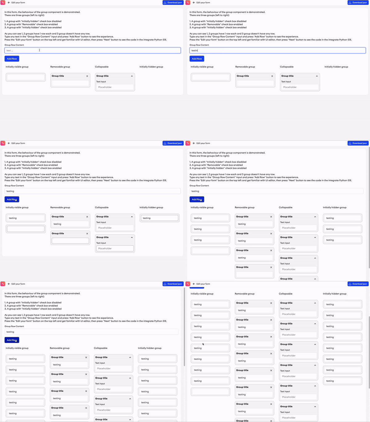
The Group is a container component which can be used to create multiple rows of itself. It is useful for creating conversation-like experiences where you need to have multiple rows of same selection of components.
Parameters
Initially hidden- Checkbox. Disabled by default. When enabled, one row of the group is created during the initialization stage of the editor.Removable- Checkbox. Disabled by default. When enabled, anXbutton will be added to each row of the group, providing the option to delete the row.Collapsible- Checkbox. Disabled by default. When enabled, you can collapse and expand the group as needed.Selectable- Checkbox. Disabled by default. When enabled, it allows you to select the group component when annotating the form.Select type- IfSelectableis enabled, then you can choose betweenSingle-selectandMulti-select.
Related functions
repeatRow(path: List[Union[str, int]])- Appends a row to the group, returns the path of the newly created row.deleteRow(path: List[Union[str, int]])- Deletes the row of the group, specified by the row index in thepath.getGroupLength(path: List[Union[str, int]])- Returns the length of the group (the number of rows).getSelectedGroups(path: List[Union[str, int]] = None)- If there are group components with theSelectableproperty enabled, then this returns all selected groups.sa.isValid(path: str | list[str])-trueif all referenced components have valid values,falseif any component is invalid or fails validation. For this component, the function will consider only the children components for validation.
Related events
on_<component id>_change(path: List[Union[str, int]]):- Fired when a group row is deleted by the user by pressing theXbutton, receives the path of the newly deleted row.

Grid
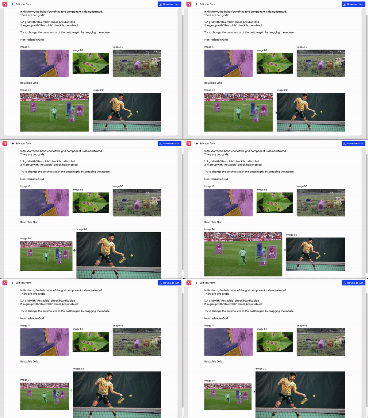
The Grid is a container component which provides the ability to horizontally arrange content in the UI.
Parameters
Resizable- Checkbox. Disabled by default. When enabled, it is possible to resize the width of each column in the grid.Columns- Manipulation menu. Here you can add or remove columns, and set their height.Sticky- Checkbox. Disabled by default. This can be enabled on each individual column to make it sticky on the form.+ Add column- Clicking this'll add another column. You can remove them again by clicking the delete button on the right side of each column.
Related function
sa.isValid(path: str | list[str])-trueif all referenced components have valid values,falseif any component is invalid or fails validation. For this component, the function will consider only the children components for validation.

Tabs
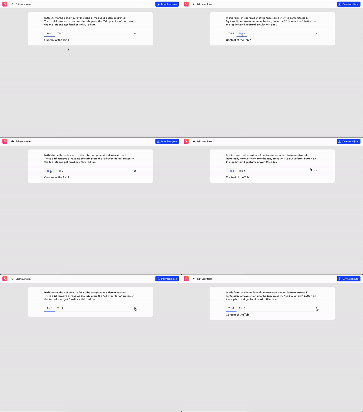
Tabs are a container component that allows you to organize and structure your content into separate tabs. Each tab's content is only visible when that tab is selected.
Parameters
Tabs- Here you can add, remove, and rename tabs. You may also enable tab icons for additional label customization.Layout- You can select Vertical or Horizontal to define how the tabs and their content are laid out.Tab width- The default width of all tabs.Container height- The height of the container. If left on auto, the component’s height will match the content within the tab that’s currently open. If the height is fixed, the content window becomes scrollable.Max Height- toggle, disabled by default - You can toggle this setting to enable or disable a maximum height for the component. When enabled, any increase in the component’s height from added content will not exceed the set maximum height.+ Add tab- Clicking this'll add another tab. You can remove them again by clicking the delete button on the right side of each tab.Visibility- When setting the Visibility conditions for this component, you can apply different conditions per tab.
Related functions
changeTab(path: List[Union[str, int], index: int)- Changes the focused tab, as specified by the tab index.sa.isValid(path: str | list[str])-trueif all referenced components have valid values,falseif any component is invalid or fails validation. For this component, the function will consider only the children components for validation.

Related events
on_componentID_tab_change(path, index) - triggered whenever the user switches between tabs in the editor or preview.
Divider
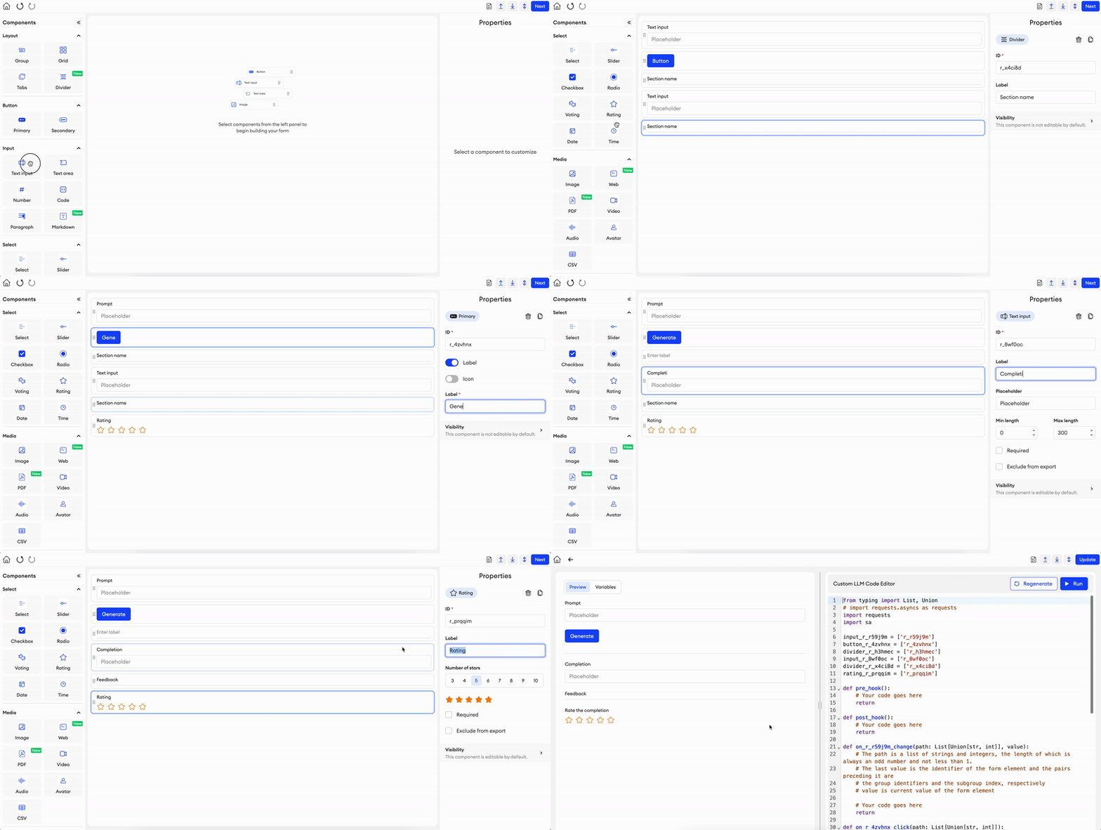
This component allows you to divide sections of your form with a horizontal line.
Parameters
Label- Text input indicating the label of the component visible in the UI.Add info icon- Disabled by default. When enabled, it shows a tooltip icon on the component. The tooltip shows text that can be entered in the component’s properties.

Updated about 1 month ago