
Input
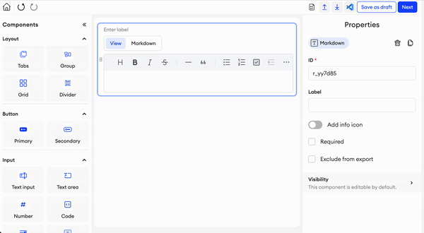
Markdown
This component allows you to input text using the markdown format. Refer to the following syntax guides if needed: 1, 2
Parameters
Label- Text input indicating the label of the component visible in the UI.Add info icon- Disabled by default. When enabled, it shows a tooltip icon on the component. The tooltip shows text that can be entered in the component’s properties.Width- The default width of the component.Height- The default height of the component.Max Height- toggle, disabled by default - You can toggle this setting to enable or disable a maximum height for the component. When enabled, any increase in the component’s height from added content will not exceed the set maximum height.Exclude from annotation JSON- If checked, this component and its values will be excluded from the item’s annotation JSON. You also won’t be able to upload data for it.Required- Checkbox. Disabled by default. When enabled, input is considered invalid when there is no text (it is impossible to complete items with invalid inputs).Text direction- Under Format, you can select what direction the text should go: Left to right, Right to left, or Auto (based on the text language).
Image supportMarkdown components support two types of images: Base64 and URLs.
We recommend using image URLs by default and Base64 only when necessary.
Use small image files to avoid overloading the form JSON with large files.
Related Functions
getValue(path: List[Union[str, int]])- Returns the data of the component.setValue(path: List[Union[str, int]], value: str)- Sets the data of the component.
Related Events
on_<component id>_change(path: List[Union[str, int]], value: str):- Fired when the code value is changed by the user, receives the component's path and the code value.
Text area
This is a text box that gives the user a large area to input text into. This can be used for cases where longer/bigger answers are required.
Parameters
Label- Text input indicating the label of the component visible in the UI.Add info icon- Disabled by default. When enabled, it shows a tooltip icon on the component. The tooltip shows text that can be entered in the component’s properties.Placeholder- Text input indicating the placeholder.Min length- Minimum text length to consider the input as valid.Max length- Maximum text length to consider the input as valid.Required- Checkbox. Disabled by default. When enabled, input is considered invalid when there is no text (it is impossible to complete items with invalid inputs).Hide during labeling- Checkbox. Disabled by default. When enabled, this component will be hidden on the main form. This option is useful when you want to store any data in the background.Width- The default width of the component.Height- The default height of the component.Max Height- toggle, disabled by default - You can toggle this setting to enable or disable a maximum height for the component. When enabled, any increase in the component’s height from added content will not exceed the set maximum height.Exclude from export- Checkbox. Disabled by default. When enabled, the value of the component will be excluded from the exported annotation JSON.Text direction- Under Format, you can select what direction the text should go: Left to right, Right to left, or Auto (based on the text language).
Related Functions
-
getValue(path: List[Union[str, int]])- Returns the data of the component. -
setValue(path: List[Union[str, int]], value: str)- Sets the data of the component. -
disable(path: List[Union[str, int]])- Disables the component. -
enable(path: List[Union[str, int]])- Enables the component.
Related Events
on_<component id>_change(path: List[Union[str, int]], value: str):- Fired when the text value is changed by the user, receives the component's path and the text value.

Number
This is a numeric input field. The number entered here can be increased or decreased by using the arrows on the right side of the input field.
Parameters
Label- Text input indicating the label of the component visible in the UI.Add info icon- Disabled by default. When enabled, it shows a tooltip icon on the component. The tooltip shows text that can be entered in the component’s properties.Min value- Minimum value to consider the input as valid.Max value- Maximum value to consider the input as valid.Step- Increment by which the number is modified.Width- The default width of the component.Required- Checkbox. Disabled by default. When enabled, input is considered invalid when there is no text (it is impossible to complete items with invalid inputs).Hide during labeling- Checkbox. Disabled by default. When enabled, this component will be hidden on the main form. This option is useful when you want to store any data in the background.Exclude from export- Checkbox. Disabled by default. When enabled, the value of the component will be excluded from the exported annotation JSON.
Related Functions
-
getValue(path: List[Union[str, int]])- Returns the data of the component. -
setValue(path: List[Union[str, int]], value: Union[int, float])- Sets the data of the component. -
disable(path: List[Union[str, int]])- Disables the component. -
enable(path: List[Union[str, int]])- Enables the component.
Related Events
on_<component id>_change(path: List[Union[str, int]], value: Union[int, float]):- Fired when the number value is changed by the user, receives the component's path and the number value.

Code
This is a code component that allows the user to write or edit any kind of code. If you type in a default code block, it can later be edited when viewed in the form.
Parameters
Label- Text input indicating the label of the component visible in the UI.Add info icon- Disabled by default. When enabled, it shows a tooltip icon on the component. The tooltip shows text that can be entered in the component’s properties.Required- Checkbox. Disabled by default. When enabled, input is considered invalid when there is no text (it is impossible to complete items with invalid inputs).Width- The default width of the component.Height- The default height of the component.Max Height- toggle, disabled by default - You can toggle this setting to enable or disable a maximum height for the component. When enabled, any increase in the component’s height from added content will not exceed the set maximum height.Code Language- A selection of code languages you can choose from for your code component.Exclude from export- Checkbox. Disabled by default. When enabled, the value of the component will be excluded from the exported annotation JSON.
Related Functions
getValue(path: List[Union[str, int]])- Returns the data of the component.setValue(path: List[Union[str, int]], value: str)- Sets the data of the component.
Related Events
on_<component id>_change(path: List[Union[str, int]], value: str):- Fired when the code value is changed by the user, receives the component's path and the code value.

Paragraph
This is a text component. You can have a paragraph of text on your form, with or without a label.
Parameters
Label- Text input indicating the label of the component visible in the UI.Add info icon- Disabled by default. When enabled, it shows a tooltip icon on the component. The tooltip shows text that can be entered in the component’s properties.Text- The text content of the paragraph.Width- The default width of the component.Height- The default height of the component.Max Height- toggle, disabled by default - You can toggle this setting to enable or disable a maximum height for the component. When enabled, any increase in the component’s height from added content will not exceed the set maximum height.Horizontal alignment- You can align the paragraph to the Left, Center, or Right.Exclude from export- Checkbox. Disabled by default. When enabled, the value of the component will be excluded from the exported annotation JSON.
Related Functions
getValue(path: List[Union[str, int]])- Returns the data of the component.setValue(path: List[Union[str, int]], value)- Sets the data of the component.

Text input
This field can be used for any case (name, email, etc.) and can be further edited by label, placeholder and more.
Parameters
Label- Text input indicating the label of the component visible in the UI.Add info icon- Disabled by default. When enabled, it shows a tooltip icon on the component. The tooltip shows text that can be entered in the component’s properties.Placeholder- Text input indicating the placeholder.Min length- Minimum text length to consider the input as valid.Max length- Maximum text length to consider the input as valid.Width- The default width of the component.Required- Checkbox. Disabled by default. When enabled, input is considered invalid when there is no text (it is impossible to complete items with invalid inputs).Hide during labeling- Checkbox. Disabled by default. When enabled, this component will be hidden on the main form. This option is useful when you want to store any data in the background.Exclude from export- Checkbox. Disabled by default. When enabled, the value of the component will be excluded from the exported annotation JSON.Text direction- Under Format, you can select what direction the text should go: Left to right, Right to left, or Auto (based on the text language).
Related Functions
getValue(path: List[Union[str, int]])- Returns the data of the component.setValue(path: List[Union[str, int]], value: str)- Sets the data of the component.disable(path: List[Union[str, int]])- Disables the component.enable(path: List[Union[str, int]])- Enables the component.
Related Events
on_<component id>_change(path: List[Union[str, int]], value: str):- Fired when the text value is changed by the user, receives the component's path and the text value.

Updated 4 months ago