
Custom components
Introduction
With custom components, you can extend the functionality of your multimodal annotation interface beyond the standard elements. Whether you’re embedding specialized visualizations, creating custom controls, or integrating third-party tools, custom components provide a flexible canvas for advanced user interactions.
How to use a custom component
Code fully defines custom components, giving you complete control over their functionality and design. To use an existing custom component in your UI, follow these steps:
- Find the Code
- You can explore pre-built custom components in your Component Gallery or external sources like GitHub.
- Ensure you have the full HTML/JS code for the component you intend to use.
- Add a Web Component
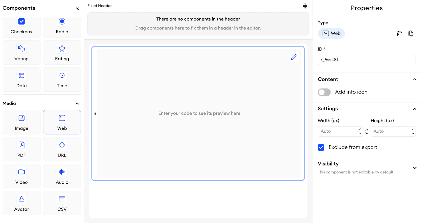
- In the UI Builder, locate the Web Component in the component list.
- Drag it onto your canvas.
- Paste the Code
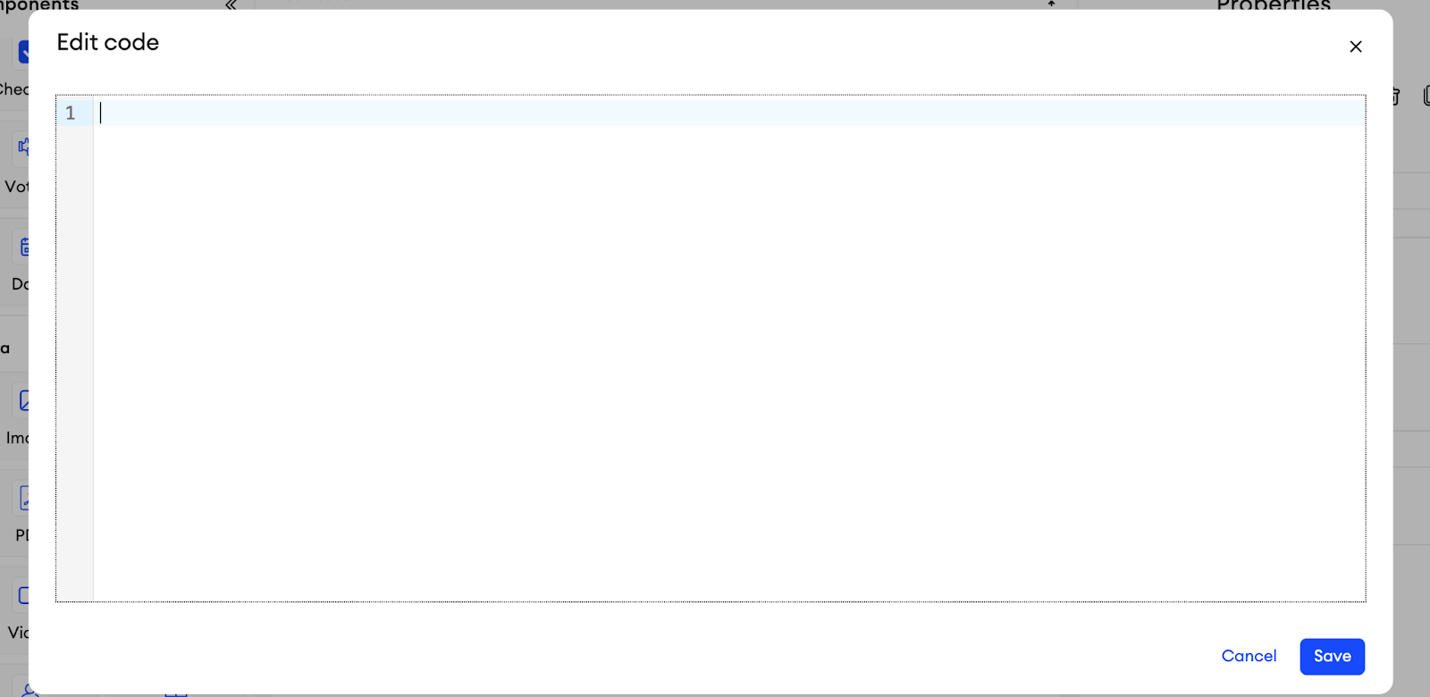
- Select the Web Component and click the pencil icon to open its built-in code editor.
- Paste your custom component’s HTML and JavaScript code directly into the editor.
- Save and Test
- Click Save.
- Open the Preview to confirm that your custom component is rendering and behaving correctly.
- Tweak the code if needed to suit your UI’s requirements (e.g., sizing, default data).
Creating a custom component
If you’d like to build your own custom UI element instead of using a prebuilt snippet:
- Add a Web Component
- Drag the Web Component from the UI Builder onto the canvas.
- Open the code editor by clicking the pencil icon in the corner of the component.
- Structure Your Component
In the code editor, you’ll see a simple HTML file. A typical minimal structure might look like this:<!DOCTYPE html> <html lang="en"> <head> <meta charset="utf-8"> <meta name="viewport" content="width=device-width, initial-scale=1"> <title>My Custom Component</title> <style> /* Optional: Add custom CSS here */ </style> </head> <body> <!-- Add your HTML elements here --> <div id="root"></div> <script> // Add JavaScript logic here </script> </body> </html> - Add Interactivity
- In the
<script>tag, write JavaScript to define how your component handles user inputs, renders dynamic data, etc. - Because each web component is rendered within an iframe, it’s isolated from the rest of the page. This design provides robust sandboxing for security and stability.
- In the
How to send and receive data
One of the key advantages of custom components is that they can communicate with the rest of your annotation interface. This happens through SuperAnnotate’s built-in messaging system.
In the Custom Component
Set up a reference to SA (SuperAnnotate’s in-iframe API object), then define how you handle incoming and outgoing messages:
<script>
let SA;
if ("SA" in window) {
  SA = window.SA;

  // Listen for messages sent from Python code (postMessageToWebComponent)
  SA.onMessage(async (message) => {
    if (!message) return;
    // Perform actions based on the received message
    console.log("Received from Python:", message);
  });

  // Dispatch events back to Python
  function sendDataToPython(data) {
    SA.dispatchEvent({
      // The structure of this message is up to you
      myCustomKey: data
    });
  }

  // Example usage
  document.getElementById("root").onclick = () => {
    sendDataToPython("Hello from inside the custom component!");
  };
}
</script>
Inside the Code Editor
Use the following methods to interact with the custom component:
-
Receive Data from the Custom Component
In your
__init__.py(or another Python file), create an event handler using the naming patternon_<component_id>_wcevent:def on_my_custom_component_wcevent(path, message): # path: the path to this Web Component in the UI # message: the dictionary object dispatched from the JS side print("Data from custom component:", message) # Perform further logic, e.g., setValue, showNotification, etc. -
Send Data to the Custom Component
If you want to push data from Python to the custom component, call:sa.postMessageToWebComponent(['my_custom_component_id'], { "someKey": "Hello from Python!" })
Note: The second argument must be a dictionary, which the JS code can interpret any way you like.
Tips and Best Practices
- Keep It Self-Contained: Because the component is in an iframe, store your entire logic—HTML, CSS, JS—in one place where possible.
- Use Minimal Dependencies: If you need external libraries (e.g., D3.js), consider loading them via
<script>tags or a CDN. - Avoid Bloated Bundles: Large libraries might slow down your annotation interface. Test performance before deploying.
- Check component sizing: If your component’s size changes (e.g., expands dynamically), ensure it remains user-friendly inside the UI layout.
- Security & Isolation: The iframe structure offers sandboxing. Still, be mindful of any external script sources you add to avoid security risks.
Next Steps
- Consult the Example Guide: Check out our End-to-End Custom Component Example for a complete walkthrough.
- Extend with Python: Combine your custom component with Python event handlers or Orchestrate calls to handle complex workflows.
- Share Components: Export and import your custom components across projects to maintain consistency and save development time.
Updated about 1 month ago