Select
Select
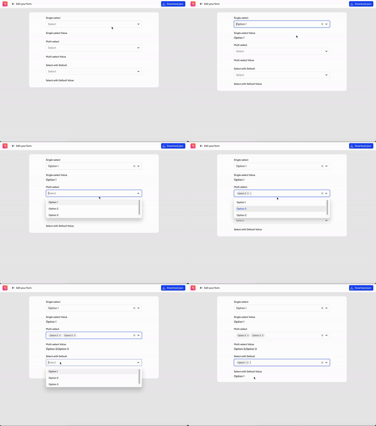
This allows you to add a dropdown menu to your form with selectable options.
Parameters
Label- Text input indicating the label of the component visible in the UI.Add info icon- Disabled by default. When enabled, it shows a tooltip icon on the component. The tooltip shows text that can be entered in the component’s properties.Placeholder- Text input indicating the placeholder.Select type- Radio button. You can specify if the options should be single or multi-select.Option types- For the component’s option types, you may select either Static or Dynamic:- Static - You may create multiple options and values when configuring the component, and also define which option is the default.
- Dynamic - You may use the
sa.setOptions()function in the Code Editor to set options and their values dynamically.
+ Add option- Clicking this'll add another option. You can remove them again by clicking the delete button on the right side of each option.Reset defaults- If you have one or multiple options selected as the default, this'll reset the selection.Width- The default width of the component.Required- Checkbox. Disabled by default. When enabled, input is considered invalid when there is no text (it is impossible to complete items with invalid inputs).Exclude from annotation JSON- If checked, this component and its values will be excluded from the item’s annotation JSON. You also won’t be able to upload data for it.
Related Functions
-
getValue(path: List[Union[str, int]])- Returns the data of the component. -
setValue(path: List[Union[str, int]], value)- Sets the data of the component.- For single-select:
value: str. - For multi-select:
value: List[str].
- For single-select:
-
sa.setOptions()- Sets a Dynamic option’s values. These options must be set every time an item’s opened, as they won’t be saved in the form and annotation JSON files.- If you want to append a new option to a list of existing options, you’ll need to
getthe options already set in the form, input your additional option, andsetthe options altogether.
- If you want to append a new option to a list of existing options, you’ll need to
-
sa.getOptions()- Retrieves the list of options in the Select component. Options must first be set while the item is open in the editor before this function can retrieve them. -
disable(path: List[Union[str, int]])- Disables the component. -
enable(path: List[Union[str, int]])- Enables the component.
Related Events
on_<component id>_change(path: List[Union[str, int]], value):- Fired when the checkbox value is changed by the user, receives the component's path and the checkbox value.- For single-select:
value: str. - For multi-select:
value: List[str].
- For single-select:
Slider
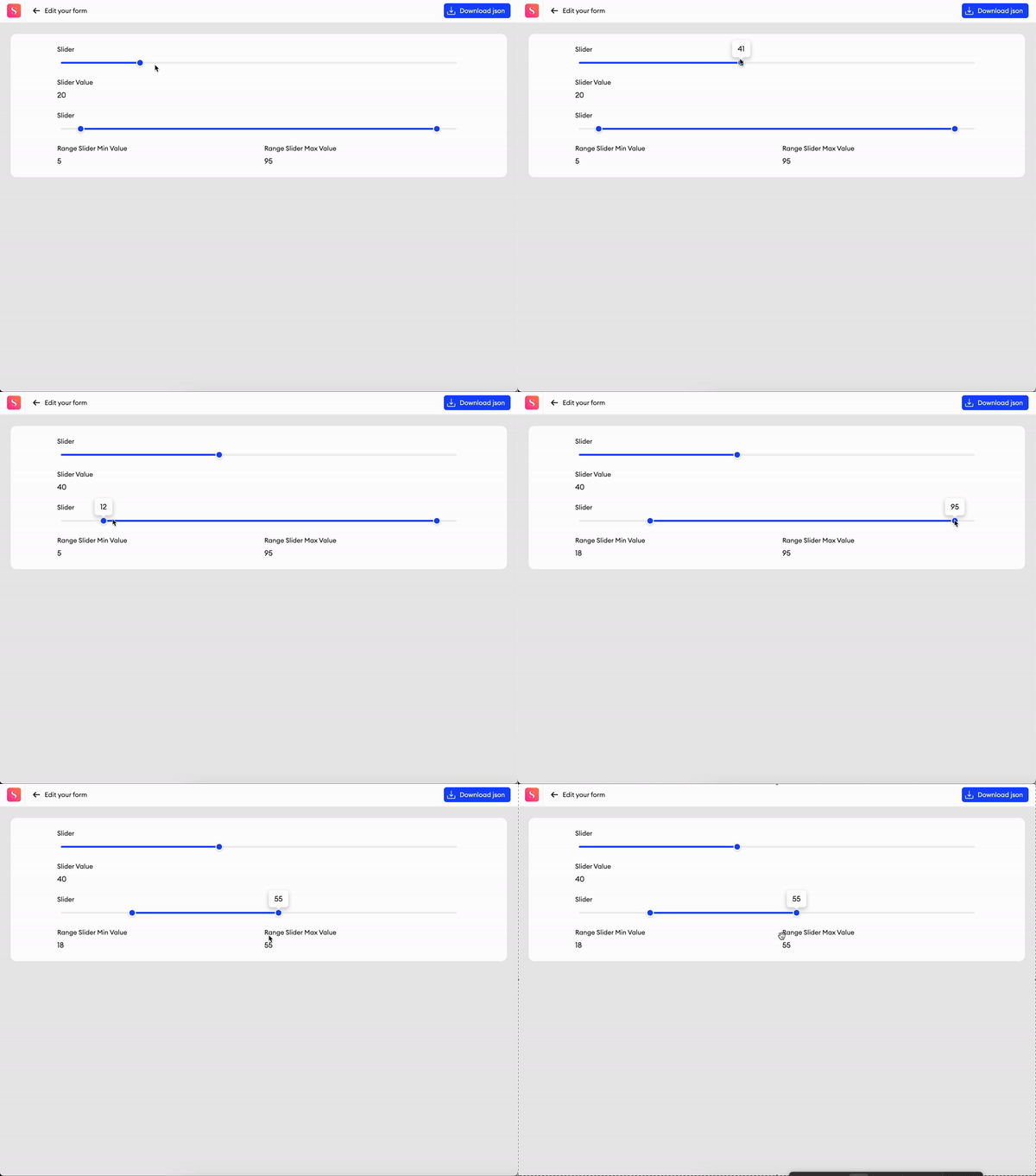
This slider can be used to set a range between two numbers. You may select a value by dragging the slider’s point, or you may enter the value manually in the field.
Parameters
Label- Text input indicating the label of the component visible in the UI.Add info icon- Disabled by default. When enabled, it shows a tooltip icon on the component. The tooltip shows text that can be entered in the component’s properties.Min value- Minimum value of the slider.Max value- Maximum value of the slider.Step- Increment by which the number is modified.Suffix- A suffix appended to the slider value popup.Required- Checkbox. Disabled by default. When enabled, input is considered invalid when there is no text (it is impossible to complete items with invalid inputs).Width- The default width of the component.Required- Checkbox. Disabled by default. Only available for Regular sliders. When enabled, input is considered invalid when there is no text (it is impossible to complete items with invalid inputs).Exclude from export- Checkbox. Disabled by default. When enabled, the value of the component will be excluded from the exported annotation JSON.
Related Functions
-
getValue(path: List[Union[str, int]])- Returns the data of the component. -
setValue(path: List[Union[str, int]], value: Union[int, float])- Sets the data of the component. -
disable(path: List[Union[str, int]])- Disables the component. -
enable(path: List[Union[str, int]])- Enables the component.
Related Events
on_<component id>_change(path: List[Union[str, int]], value: Union[int, float]):- Fired when the slider value is changed by the user, receives the component's path and the slider value.- For the range slider:
value: Union[int, [int], float, [float]]
- For the range slider:
Checkbox
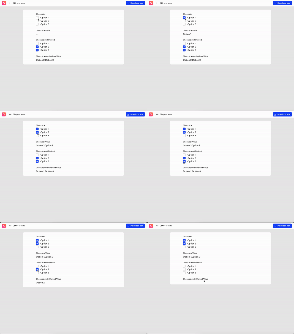
This component provides text label to input a name, sentence or question, as well as a list of multiple selection options.
Parameters
Label- Text input indicating the label of the component visible in the UI.Add info icon- Disabled by default. When enabled, it shows a tooltip icon on the component. The tooltip shows text that can be entered in the component’s properties.Required- Checkbox. Disabled by default. When enabled, input is considered invalid when there is no text (it is impossible to complete items with invalid inputs).Exclude from export- Checkbox. Disabled by default. When enabled, the value of the component will be excluded from the exported annotation JSON.Layout- You can choose to have your options displayed vertically in a single column, or you can display them on a line horizontally that wraps as it reaches the edge of the component.Width- The default width of the component.Options- Manipulation menu. Here you can add, remove and rename options. You can define default values as well.+ Add option- Clicking this'll add another option. You can remove them again by clicking the delete button on the right side of each option.Reset defaults- If you have one or multiple options selected as the default, this'll reset the selection.
Related Functions
-
getValue(path: List[Union[str, int]])- Returns the data of the component. -
setValue(path: List[Union[str, int]], value: List[str])- Sets the data of the component. -
disable(path: List[Union[str, int]])- Disables the component. -
enable(path: List[Union[str, int]])- Enables the component.
Related Events
on_<component id>_change(path: List[Union[str, int]], value: List[str]):- Fired when the checkbox value is changed by the user, receives the component's path and the checkbox value.
Radio
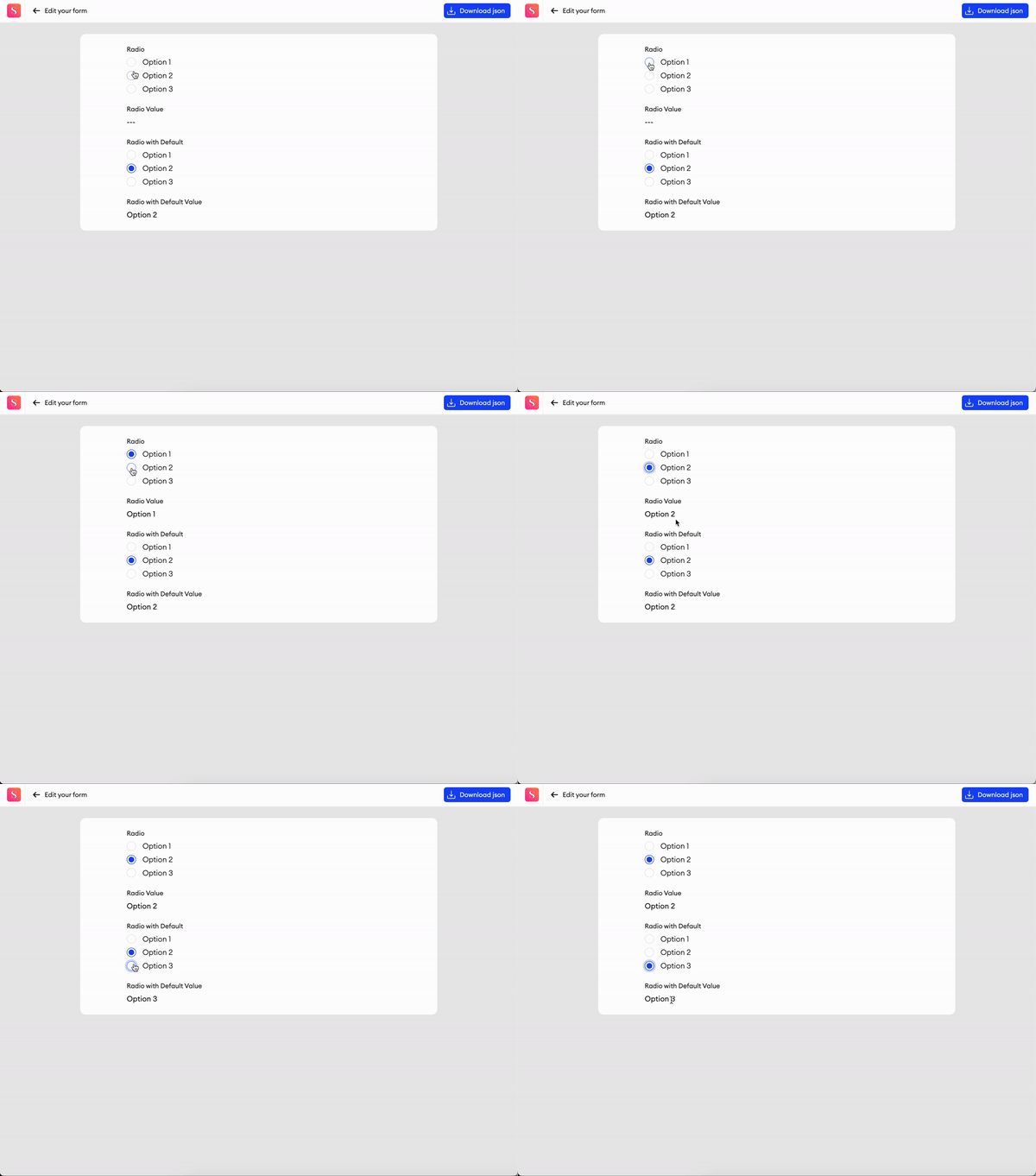
This component provides text label to input a name, sentence or question, as well as a list of single selection options.
Parameters
Label- Text input indicating the label of the component visible in the UI.Add info icon- Disabled by default. When enabled, it shows a tooltip icon on the component. The tooltip shows text that can be entered in the component’s properties.Required- Checkbox. Disabled by default. When enabled, input is considered invalid when there is no text (it is impossible to complete items with invalid inputs).Exclude from export- Checkbox. Disabled by default. When enabled, the value of the component will be excluded from the exported annotation JSON.Layout- You can choose to have your options displayed vertically in a single column, or you can display them on a line horizontally that wraps as it reaches the edge of the component.Width- The default width of the component.Options- Manipulation menu. Here you can add, remove and rename options. You can define default values as well.+ Add option- Clicking this'll add another option. You can remove them again by clicking the delete button on the right side of each option.Reset defaults- If you have an option selected as the default, this'll reset the selection.
Related Functions
-
getValue(path: List[Union[str, int]])- Returns the data of the component. -
setValue(path: List[Union[str, int]], value: str)- Sets the data of the component. -
disable(path: List[Union[str, int]])- Disables the component. -
enable(path: List[Union[str, int]])- Enables the component.
Related Events
on_<component id>_change(path: List[Union[str, int]], value: str):- Fired when the radio value is changed by the user, receives the component's path and the radio value.
Voting
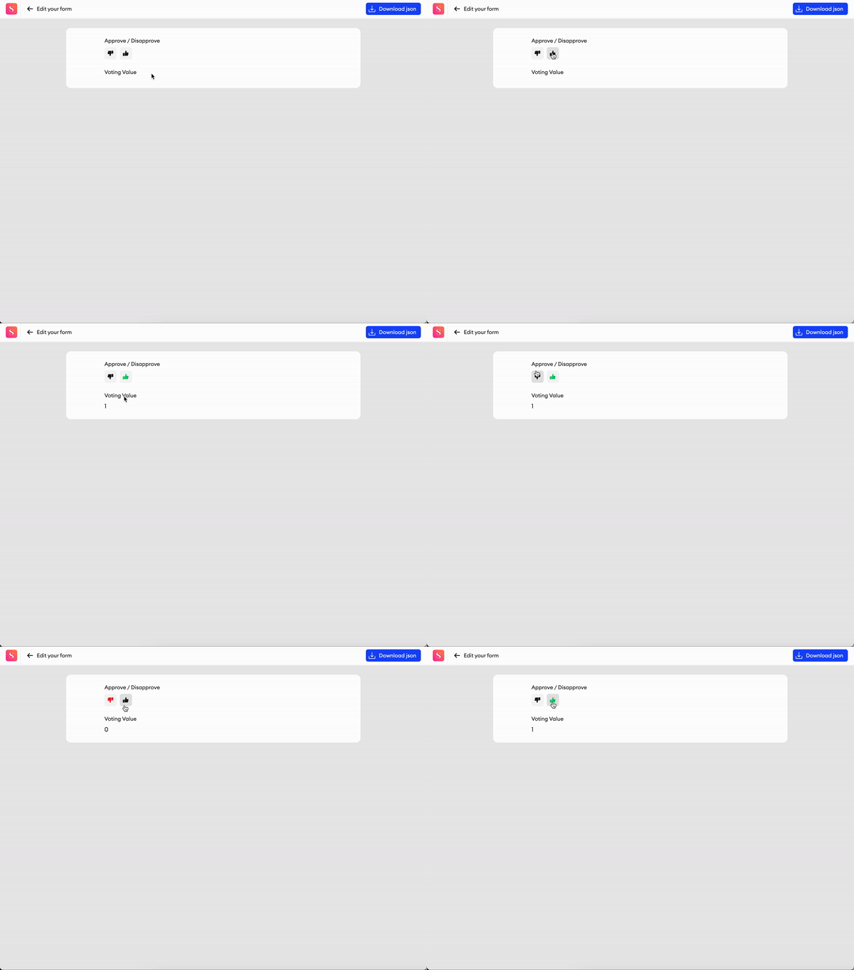
With this component, you can add an approval response.
Parameters
Label- Text input indicating the label of the component visible in the UI.Add info icon- Disabled by default. When enabled, it shows a tooltip icon on the component. The tooltip shows text that can be entered in the component’s properties.Required- Checkbox. Disabled by default. When enabled, input is considered invalid when there is no text (it is impossible to complete items with invalid inputs).Exclude from export- Checkbox. Disabled by default. When enabled, the value of the component will be excluded from the exported annotation JSON.
Related Functions
-
getValue(path: List[Union[str, int]])- Returns the data of the component. -
setValue(path: List[Union[str, int]], value: int)- Sets the data of the component. -
disable(path: List[Union[str, int]])- Disables the component. -
enable(path: List[Union[str, int]])- Enables the component.
Related Events
on_<component id>_change(path: List[Union[str, int]], value: int):- Fired when the voting value is changed by user, receives the component's path and the voting value -0or1.
Rating
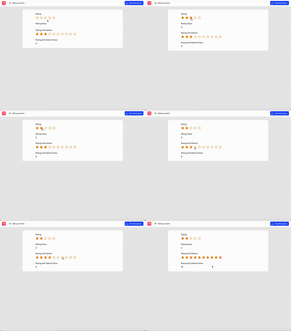
This component allows you to add a rating to your form.
Parameters
Label- Text input indicating the label of the component visible in the UI.Add info icon- Disabled by default. When enabled, it shows a tooltip icon on the component. The tooltip shows text that can be entered in the component’s properties.Number of stars- Number of stars to use in the rating.Required- Checkbox. Disabled by default. When enabled, the input is considered invalid if left empty (it is impossible to complete items with invalid inputs).Exclude from export- Checkbox. Disabled by default. When enabled, the value of the component will be excluded from the exported annotation JSON.
Related Functions
-
getValue(path: List[Union[str, int]])- Returns the data of the component. -
setValue(path: List[Union[str, int]], value: int)- Sets the data of the component. -
disable(path: List[Union[str, int]])- Disables the component. -
enable(path: List[Union[str, int]])- Enables the component.
Related Events
on_<component id>_change(path: List[Union[str, int]], value: int):- Fired when the rating value is changed by the user, receives the component's path and rating.
Date
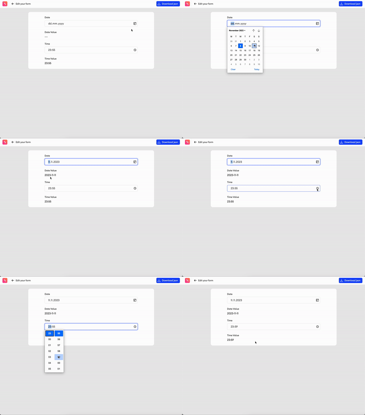
This component allows you to choose a specific time or date.
Parameters
Label- Text input indicating the label of the component visible in the UI.Add info icon- Disabled by default. When enabled, it shows a tooltip icon on the component. The tooltip shows text that can be entered in the component’s properties.Include time- Checkbox. Disabled by default. When enabled, the time picker is visible.Width- The default width of the component.Required- Checkbox. Disabled by default. When enabled, the input is considered invalid when there is no text (it is impossible to complete items with invalid inputs).Exclude from export- Checkbox. Disabled by default. When enabled, the value of the component will be excluded from the exported annotation JSON.
Related Functions
-
getValue(path: List[Union[str, int]])- Returns the data of the component. -
setValue(path: List[Union[str, int]], value: str)- Sets the data of the component. -
disable(path: List[Union[str, int]])- Disables the component. -
enable(path: List[Union[str, int]])- Enables the component.
Related Events
on_<component id>_change(path: List[Union[str, int]], value: str):- Fired when the date/time value is changed by the user, receives the component's path and the date/time value.

Time
This component allows you to choose a specific time.
Parameters
Label- Text input indicating the label of the component visible in the UI.Add info icon- Disabled by default. When enabled, it shows a tooltip icon on the component. The tooltip shows text that can be entered in the component’s properties.Width- The default width of the component.Required- Checkbox. Disabled by default. When enabled, the input is considered invalid when there is no text (it is impossible to complete items with invalid inputs).Exclude from export- Checkbox. Disabled by default. When enabled, the value of the component will be excluded from the exported annotation JSON.
Related Functions
-
getValue(path: List[Union[str, int]])- Returns the data of the component. -
setValue(path: List[Union[str, int]], value: str)- Sets the data of the component. -
disable(path: List[Union[str, int]])- Disables the component. -
enable(path: List[Union[str, int]])- Enables the component.
Related Events
on_<component id>_change(path: List[Union[str, int]], value: str):- Fired when the time value is changed by the user, receives the component's path and the time value.
Updated 4 months ago